Showing posts with label Research. Show all posts

Tuesday, 26 March 2013

Film Production Company


Every film has the name of their production company at the start of the film. We decided that as a group we would create our own one, this was so our trailer would seem more genuine and professional. It’s also individualistic as it wouldn’t have been used anywhere else. So the audience can instantly recognise the production company and link it to our trailer.

We decided to call our production company ‘Absolute Productions’ this is because absolute can be seen as being true and realistic to daily life, this relates back to our 'social realist' genre, as social realist films focus on topical and real issues of a modern society.

 The use of droplets is a representation of our trailer; this is obvious as the use of water droplets occurs twice within the trailer. The first is at the beginning of the trailer and the second is at the end of the trailer when a paintbrush falls in to a bucket of water. The fact these are the beginning and end images shows the significance of this image.

Monday, 4 March 2013

Audience Profile

This was our audience profile so that we could clearly direct our trailer at our specific target audience. Having a specific character in mind helped us to make our decisions and include aspects such as the Sex scene, the bad boyfriend and the pregnancy test into our trailer because we knew that our character 'Gemma' would be attracted to it.


Click on the picture to see the 'ideal' viewer

Monday, 28 January 2013

First Draft and Feedback

We decided to publish our first draft of our trailer onto our YouTube channel to see the responses that we get. This will be useful for gathering research on how to improve it.


We have evaluated our draft to ensure that we can improve the necessary faults so our final cut matches the conventions of a social realism. We answered the question 'In what ways does your media product use, develop or challenge forms and conventions of real media products in association with our trailer?' 

After reviewing our draft, we concluded what strengths and weaknesses the product had. These include:

Strengths 
- Award research
- Original film production company
- Creative font- for anchorage and title sequence
- Use of colour filters- black and white at the end
- Variety of editing techniques- reverse of girl's journey, slow motion in bedroom scene
- Variety of shots- tracking shot, point of view shot, high angle shot
- Variety of lighting- low key and high key lighting
- Good camera quality- Cannon with changeable lens and excellent zoom and focus features

Weaknesses 
- Sound is not as layered
- Voiceovers are not embedded- they stick out and sound irregular
- Shots of the laptop are basic and boring- too amateur, does not show our skill and genre


There are certain conventions that you expect to see in a social realism that we should include in our trailer to demonstrate how we have understood and reproduced a social realist trailer. 
In our first draft we have matched the conventions in many ways:

- We have included a main protagonist (the girl) which is a convention of a social realist text
- We have depicted a working class lifestyle through the housing estate shots
- The actress is an unknown female which confirms the genre
- The storyline matches the conventions as it is hard hitting and emotional through shots such as the dad with the belt and the scene with the girl in bed with the boy.
- Social Realist films normally use mostly diegetic sound which we used through dialogue
- One of our themes was sex which is a common trait of social realisms
- We challenge the stereotypes of the genre by narrowing the themes, excluding drugs, alcohol and antisocial behaviour.

Wednesday, 23 January 2013

Further Tagline Research


We decided that to decide our tagline, it is best that we made a list and sent out a questionnaire to ask our target audience which one they think is the most effective or best fitted for our film.

- The art of making the right choice, is harder than you think.
- All our dreams can come true, if we have the courage to pursue them.
- Dreams are your paints, the world is your canvas. Believing, is the brush that converts your dreams into a masterpiece.
- One Girl, One Life.

We decided to use the tagline 'the art of making the right choice, is harder than you think'. We felt this was ironic as she has an art talent, and people will get the the tagline after watching the trailer and will attract people to watch the movie. However we also felt the phrase 'the art of' would be suitable for making choices as well, no matter her art talent. So although it may not be an obvious link to her art talent, we felt it was subtle enough to be noticed.

We felt this also encorporated the choice of her life she has to take in the movie and thus helps the viewer understand more about the storyline, and keeps them on the cliffhanger as we know there will be an important choice at one point in the movie.


'The art of making the right choice, is harder than you think.'

Tuesday, 8 January 2013

Tag Lines

In order to have an effective and eye-catching poster, we have to chose a suitable tag line. This would be beneficial when film companies are advertising their trailers.

Some initial idea:

- A girl can dream
- She has one chance, will she do the right thing?
- One moment can define everything
- One girl, one life
- Which path will she chose?
- You need challenges to keep reality real
- When someone turns against you... you don't know who to trust.
- Heart vs. Head
- Trying is sometimes just not good enough
- Trying to keep your head clear


These are only some initial basic ideas which we can build upon.

Thursday, 20 December 2012

Typography Research


In our trailer we have a title page, phrases for anchorage and nominated awards therefore it is essential to ensure our typography matches the genre and mood of our trailer.

Here are some fonts we found on dafont.com.

It is useful to do typography research as we can see which fonts stand out and which do not.


1. This font is called Sketch_Block. We decided to take into account this font because we thought it linked in well with our character having an art talent and with the sketchy look, inside the letters.


2. This font is called helveticamazing. We thought this looked good as the outline of the letters are slightly sketchy yet at the same time it looks good and not too immature like a child has drawn it.


3. This font is called FFF tusj. This one is great because of the lines looking as though the font had been planned and therefore sketched first and planned and measured which again goes well with our artistic theme.
 4. This font is called ghettomarquee. It is interesting because we thought it looks like different cut ours from magazines and this therefore depicts the teenage lifestyle that she has. This can also show her cutting and cropping of her life and how distorted it can be with the problems at home, however this isn't very easy to read.


5. This one was more plain and  simple than our other fonts we found and we thought that it would be good if we looked like it was typed to show the typing of maybe a documentary or a diary of our protagonist, however Georgia font is very iconic and therefore it may look a bit too amateur.


We decided to chose Font 2 helveticamazing as we felt this was the clearest and goes along with the style we want and the target market.

Monday, 17 December 2012

Film Awards/Reviews

The nomination of awards is important for any film, if they show that they have been nominated to win a prize the audience is more likely to watch the film as its obviously of good quality.
Across Britain and The United States there are numerous movie awards, mentions and critique.
Examples: 
  • BAFTA Awards
  • Oscars
  • Cannes Film Festival
  • Evening Standard British Film Awards
  • National Movie Awards
  • London Film Festival
  • Sundance Film Festival
  • British Independent Film Awards

Reviews are also an important part of film, if theres good reviews from a newspaper or celebrity people are more likely to watch the film. Especially if its someone or something they look up to.

For our trailer we are going to use examples of this as it makes the film seem of higher quality, and shows that its been credited so more people are likely to view it.

We have decided to feature more independent films awards in our trailer because of our social realism genre.  Examples we could include are the British Independent Film Awards and Cannes Film Festivals, as these would be more realistic than being nominated for an Oscar.

Examples of films which have won in either the British Independent Film Awards or Cannes Film festivals include; The Tree of Life, The Pianist, We Need To Talk About Kevin and Senna.

http://www.festival-cannes.fr/

Thursday, 6 December 2012

Classification

Classification is an important factor in film, as it establishes what ages are suitable for viewing.

The classification for our film will a 15, reasons for this being:
Drug taking
Discriminatory behaviour
Potential psychological effects

Why we chose the 15 rating over other ratings:

Although 12's allow some drug use, they don't allow you to glamorise it.

Our trailer features only minor drug use and discriminatory behaviour,  and so isn't enough to make the 18 rating as there is no violence or strong sexual scenes.


An example of a film which is similar to ours and has the same classification is the film Fish Tank, this is due to there being portrayals of sexual activity, discriminatory language or behaviour and some strong violence.

Our trailer is of the same genre and has a very similar style to this film, so we decided it should be the same classification.


Features of a 15 include:
  • strong violence
  • frequent strong language (eg 'f***')
  • strong verbal references to sex
  • portrayals of sexual activity
  • sexual nudity
  • brief scenes of sexual violence or verbal references to sexual violence
  • discriminatory language or behaviour
  • drug taking
http://www.bbfc.co.uk/

Tuesday, 4 December 2012

Poster Deconstruction 2 - A Way of Life

This is our second Poster Deconstructions. We think this is important and useful as we will be designing our own poster for our film and we can analyse similar ones so that we know what to include and what works well on a poster.


1. BAFTA winner -> publicity and reach - promotes the film, well-known sources so we can trust = Bafta = Iconic logo.
2. Comments by trusted people/well-known companies -> creates publicity for the film.
3. No actors/actresses names -> shows real life focusing on representing rather than 'acting'.
4. Tagline -> summarises and almost quoting from character.
-> small text - not drawn to 'making'
5. Image shows that the film is through her eyes + perspective.
-> thoughtful + emotional.
6. Image of sky showing emotions and a sense of freedom within character.
7. Can't see full face, element of mystery.
-> plain eyes (no make-up)
8. Blue tint on photo - depicts sad feel and emotion
9. Classification to show target market
10. Grass - freedom and natural aspect to her life.

Saturday, 1 December 2012

Typography Ideas

In our trailer we have a title page, phrases for anchorage and nominated awards therefore it is essential to ensure our typography matches the genre and mood of our trailer.
Here are some fonts we found on dafont.com.


These are all very different fonts, but they all give the feeling of movement and pace. The third one down matches our trailer the best as it is blurry which is what happens to your vision when you have to much to drink. Our trailer is about alcohol, drugs and teenage behaviour therefore the third one down also depicts a manic environment.

It is useful to do typography research as we can see which fonts stand out and which do not.

Saturday, 24 November 2012

Website Deconstruction 1- Kidulthood

It is useful to do website deconstructions as we will be making a website ourselves. We can see the conventions of a social realism film website and mimic the effective characteristics.

1) Effective quotes appear in the centre of the screen. Others include '"Brilliant". MTV'. These are useful to show the overall quality of the film and to persuade viewers to watch it.

2) This introduces the film and also advertises the following film 'adulthood'. The viewer can make the connection between the two films and it is obvious they are a continuing story.

3) The title is clear as it fills a huge space. It is spread along the top of the website and is eye-catching due to the white on black combination. The bold font makes it jump out at you. The inconsistency of the lower case 'i' gives the impression of uneducated characters.

4) This is another quote and almost works like a tag line. It leaves the audience in suspense as it is a rhetorical question. The use of the direct pronoun 'you've' includes the viewer and they feel personally connected.

5) The main character from the film takes up a lot of space on the websites homepage. His clothing and race make him prone to stereotypical thoughts before the audience has even seen the film. The mise-en-scene of the baseball bat adds to the idea that this film will be violent.

6) They use the website as an advertising strategy to sell the DVD. The image of the DVD box shows people exactly what it looks like and the features that come with the DVD.

7) The 'revolver entertainment' logo promotes that company but also shows who helped in the making of the film.

8) The menu at the bottom of the screen allows you to select from many different action. It shows where you can watch the trailer, download soundtracks etc.

9) This informs the audience of when the film is available to buy and corresponds with the big image of the DVD. The typography is the same for all the important messages making it easy to navigate around the page.

10) At the very bottom of the web page it shows the designers of the website, however it is not very important so it is in small font.

11) This is the selling point of the DVD. It is bragging about all the special features and bonus scenes to entice people to buy the DVD.

Thursday, 22 November 2012

Poster Deconstruction 1 - Fish Tank

This is the first of our Poster Deconstructions. We think this is important and useful as we will be designing our own poster for our film and we can analyse similar ones so that we know what to include and what works well on a poster.

Layout and Features

1. Introduction to film -> 'The' = ultimate, important, showing  what to expect -> high expectations.
2. Comments by trusted sources and companies -> publicity and reach -> trusted by the viewer. (targeted at target audience - e.g teenager magazine, if aimed at teenagers)
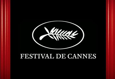
3. Using well-known names + awards promotes the film + viewers know they can trust them -> Cannes logo -> visual importance -> iconic.
4. Names of Actors/Actresses
-> small font because social realism don't want them to be unrealistic and famous as they want it as 'real' as possible.
-> focusing on representing the characters rather than acting skills.
-> [L-R] Main character order
5. Tagline -> Summarises and almost quoting from character
-> small text, not drawing attention to 'making' a tagline -> as real as possible.
-> placed at the bottom of poster, last thing you read, leaves us thinking.
6. Credits - Small (blurs into stripes on top)
-> can be read if needed -> less important as often social realism films are low budget anyway.

The Image/Representation

7. Shows the setting and background to the character -> urban area -> representing that her area/ socialisation is always in her mind -> holding her back?
8. Wearing a hoodie 
-> representation of wearing a hoodie -> youth, trouble, hiding, covering identity.
9. Stomach and bare skin showing -> representation, subtly sexual.
10. Hoop earrings and gold jewellery -> the fashion?
-> infers and represents she is socialised into this, working class, looks 'cheap'
-> 'Chav' Culture
11. Blue tint on photo - down mood, sad, cold, lonely ?
-> clouds in background shows normality and shows that it is a normal day of life.
12. Wind swept hair -> showing movement -> representing unexpected acquaintances and decisions
13. Shadow on one side of face and looking into the light -> associated with hope and freedom.
-> darkness to lightness transition- change?

Title 

14. Capital letters - simple font
-> represents simple lifestyle, nothing complicated or fancy
-> boyish to represent character
15. Orange colour
-> stands out against the blue -> protagonist wanting to stand out?

Thursday, 15 November 2012

Depression

The father character in our trailer is going to be effected by depression. This will create another sense of sympathy for our main character, as she will be a young carer.

Through our research into depression, we found that this was not a topic easily used in films as it is quite hard to address and sad to watch. However, we will be using this in our trailer to provoke sympathy for our main character, and thus giving her an explanation as to why she turns to drugs and alcohol.

The main symptoms of depression are:

- Mood Swings
- Self harm
- Isolation- father finding it hard to get out of bed
- Angry outbursts - we will show father shouting at the girl


We hope to create a character in our trailer that will mimic the kind of frustration and sadness that someone in a real life situation feels, and can relate to.

An example of depression being used in film is 'Sylvia' released in 2003. The character sinks deeper and deeper into emotional isolation and emptiness, especially after her partner leaves her for another woman.


Monday, 12 November 2012

Props


The living room will have basic furniture in. The colours will be bland and washed out.


We will need alcohol bottles and white powder to represent drugs. Also cigarettes will be used in our trailer.

Art equipment will be set up in the girl's bedroom. Her room will be plain but with tacky pink bed sheets. 

Props include:
- white powder (flour) 
- vodka bottles, beer cans, shot glasses
- cigarettes
- art equipment (paint, paint brushes, canvas)
- depression drugs
- furniture
- letter


Wednesday, 31 October 2012

Inspirations

We got ideas for our trailer from various different films and TV shows of a similar genre:


Fish Tank 

Fish Tank is a British Drama film which tells the story of fifteen year old Mia . We were especially inspired by this as it gave us the idea to give our character a sense of hope and purpose in the film. Mia's dancing abilities in Fish Tank helped us as a group to decide that our character should also have a talent which sets her apart from other people, which we decided should be art.


Skins

The party scenes from Skins were our main inspiration, we want to show how teenagers act at a party and what sort of things they are exposed to. The fast paced shots and quick edits which are seen in Skins will be very similar to what we will use in our trailer.


Tuesday, 23 October 2012

Survey

We sent out our rebellion survey a couple of weeks ago to see what responses we got. We sent it mainly to teenagers so that we could get a direct gauge on what they have opinions on and certain party incidents etc. We will look at these results to influence when setting up our scenes and the attitude that a teenager may take.


Here are our results:


- We found that 90.2% of people felt that Rule-Breaking was the most likely type of rebellion.


- The majority of people thought that Rebellion was an exciting idea in a film. (73.8% Yes, 26.2% No) 


- The most common group that people felt they rebelled against was parents/guardians


We asked why people felt the need to rebel, some of the replies were:

'Stress release to get noticed, attention, to fight for what's right'

'too boxed in, if they're underestimated or don't receive enough attention'

'to be cool, fit in'

'When you think something is unfair'

'being forced to conform to society'

'strict parents'

'to make a point'


We also asked people what they thought would be expected a teenage party, they said:

- alcohol, smoking

- drinking

- alcohol, possibly drugs, music

- drink, drugs, dancing and sex

- alcohol, smoking, sex

- lots of drink, stoners, and people having sex. possibly tears from one or two girls

- dancing, laughing, crying girl, people getting off, drugs, lots of drinking

- people becoming more violent by the amount of alcohol they have had


We then asked people to rate the most likely thing to be at a party:

1) 92.9% of people chose Alcohol as the most likely thing to be at a party

2) 34.1% of people chose Drugs as the 2nd likely thing to be at a party

3) 43.9% of people chose Sex as the 3rd likely thing to be at a party

4) 34.1% of people chose Conflict as the 4th most likely thing to be at a party

5) Violence and abuse were the least most likely thing to be at a party according to our survey

Thursday, 18 October 2012

Researching Film Companies


Film 4

Film4 Productions is a British film production company owned by Channel 4 film company. It is a large contributor to British Film making. The company cut its budget and staff significantly in 2002, due to increasing losses, and was re-integrated into the drama department of Channel 4. Because of this, social realism films are more likely to be taken on board because they are low budget and we feel this would represent our genre well. 


Studio Canal


This is a film distributor company working in the UK and Ireland. They release many films, some in a foreign language and independent British films in the UK. We felt that this would be a good choice, as it is a well-known brand in social realism films. One of the films released was called 'Au Revoir Les Enfants' which we think depicts our genre well. 


IFC

IFC (Independent Film Channel) is an American film distribution company based in New York. It mainly distributes independent films and documentaries. We decided that this could be a possible choice as IFC has distributed films such as 'Fish Tank' which follows the social realist genre that we are using in our trailer.


Wednesday, 17 October 2012

Update on our Social Networking and Research Sites

Using our Social Networking sites is helping increase the publicity of our teaser trailer and enables us to reach our target market audience easier.

Posting on our Facebook and twitter page enables people to follow our progress, in which we update less information but more links and then our Blog where we are analysing what we are doing in our coursework.

Twitter is helping us be more 'immediate' with our updates and reaches out quicker than Facebook or on Blog as most people tweet from their phones or use the twitter app.

Facebook is helping us gage how many people are interested in this kind of genre and looking at the ages and sex of people who are liking our page.

Survey Monkey is also helping us engage with our audience and ask them questions as to how they feel and what should be presented in our teaser trailer in regards to Rebellion.


Tuesday, 16 October 2012

Facebook Page


We felt that a Facebook Page will help to connect to the majority of the social networking sites, as 46% of all Facebook users in 2011 were aged between 13-25. This clearly highlights our target market and therefore we felt this would be a better connection level to this age range and therefore reaching to more people.

www.facebook.com/maniafilm2013


Tuesday, 9 October 2012

Location Research


For the location of our trailer, we are going to film in quite rundown areas and estates to show our characters working class background.


Here are some locations that have inspired and guided us when choosing our location.

 Brixton
 West Kensington
 North London
 Hackney
 Manchester